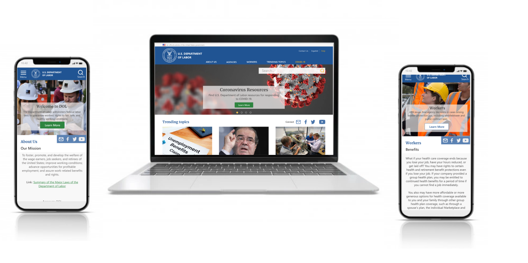
Overview
A large portion of the American population is being affected by the COVID-19 pandemic. Millions of Americans are being forced into unemployment and parents are having to balance work while caring for a child. Our teams' challenge is build an online presence so that local and small businesses can access COVID-specific information in the time of COVID.


Research & UI Analysis
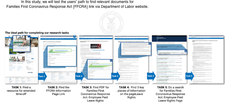
Since this redesign was for a website of a national scale, the group inital step included creating a proto-persona based on our assumptions of who a typical user of this website might be. We decided to move forward with Christine, a middle-aged woman who is remotely working from home while making sure she takes care of her kids. She goes to Dol.gov to see if there is information for paid-time off she can get due to these unforeseen circumstances. We referred back to our persona throughout the project to guide design decisions.
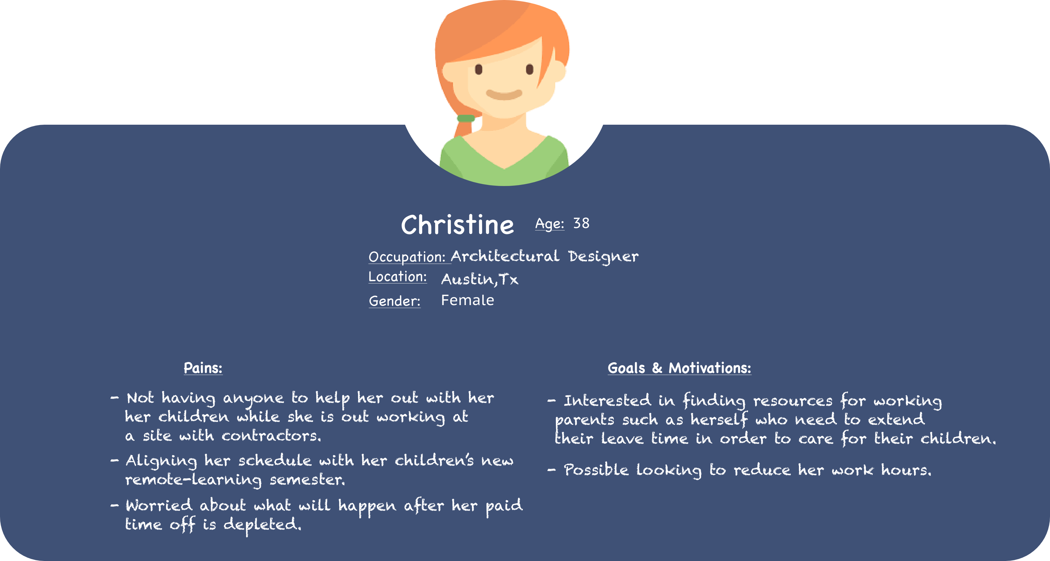
My next step in the research process was to create a user research plan and conduct preliminary usability testing. My goal here was to understand how users get to the resource page for the Families First Coronavirus Response Act from the Department of Labor Website (DOL).
Key Insights
- Users found the homepage a bit confusing, half managed to find the target and half took other routes such as searching first in "search" or "topics", causing them to miss the target.
- 80% managed to find key pieces of information on the page, but had to scan all the documents; this process is very time consuming for users.
- Only 40% of the users were able to do a search for Families First Coronavirus Response Act: Employee Paid Leave Rights Page, there was alot of frustration with the search page layout.

Information Architecture
To understand how users navigated the current Department of Labor website and what areas needed improvement, We conducted 5 user interviews through Zoom to watch users attempt to complete 5 tasks. Each test consisted five tasks using click-test method.
Overall we noticed users felt overwhelmed, confused, and frustrated with the current website layout. So, we used a card sorting technique where we reorganized the information and original navigation on the US Department of Labor site into categories that made sense for the redesign

Site Map Iteration
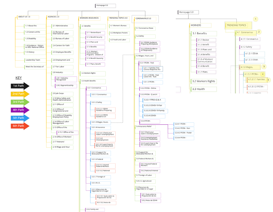
Based on the card sorting insights, we created a new site map that is simpler, focused more on reducing irrelevant information and including better visuals. Our team also referred back to the users goals and needs to determine the information hierarchy and further data-oriented UI decisions.

Wireframe sketches
My next step involved looking through our site map, user flow, feature prioritization matrix to create sketches. Since I was working with many creative designers, it was relatively easy to move straight into digitial lo-fi prototypes.
Based on our features and information architecture, we created our newly redesigned navigation bars and what it looks like clicking into the primary and secondary navigation.
Clickable Prototype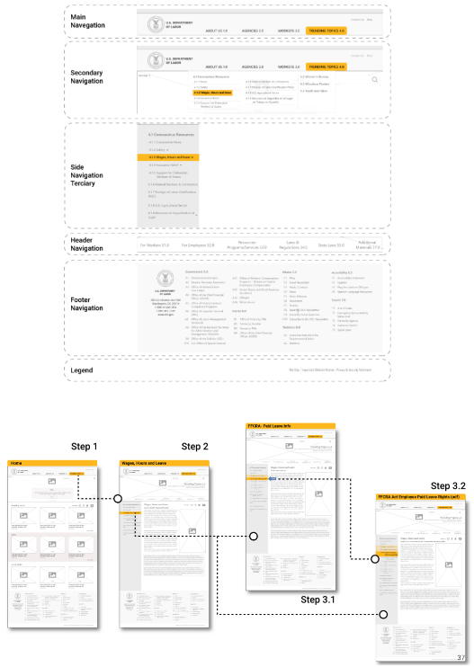

Detailed Specs
Before making those iterations and creating a hi-fi prototype, we created a UI style guide. Our goal was to stay aligned with US Department of Labor branding to ensure its a government redesign. This inolved researching the main style guide for DOL current website layout.
Our goal was to simplify the original website to look less cluttered and incorporate a more consistent UI styling throughout each page.
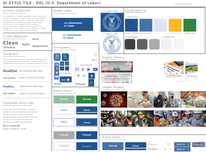

The Execution
The gallery belows shows our Hi-Fi desktop and mobile prototype.The newly redesigned prototype, we used the grid system to help organize our UI components, and in order to make it more scalable for web/mobile. In our hi-fidelity prototype, we resolved the user's pain points from the Lo-fidelity testing, aiming to make experience more intuitive.
- An example of applying grid design to our original design to make a better design for the mobile.
- We added multiple paths back to the Home Page.
- Adding "quicklinks" to the CDC guidelines by State/industry.

“Prototyping was the most effective way to gain meaningful feedback from the team, and from our stakeholders...”

Final Thoughts
Continue to test and iterate the current design to improve interactions and experience for the users.
- Government websites' UX failings stem from an overwhelming amount of information. This required paring down of information.
- Consistency Responsive web design is important and it is necessary to use UI components to ensure consistency throughout the different versions of the website.
- Testing It takes constant testing and iterating to design a usable website that contains myriad navigation options and forms of content.

