Our Solution
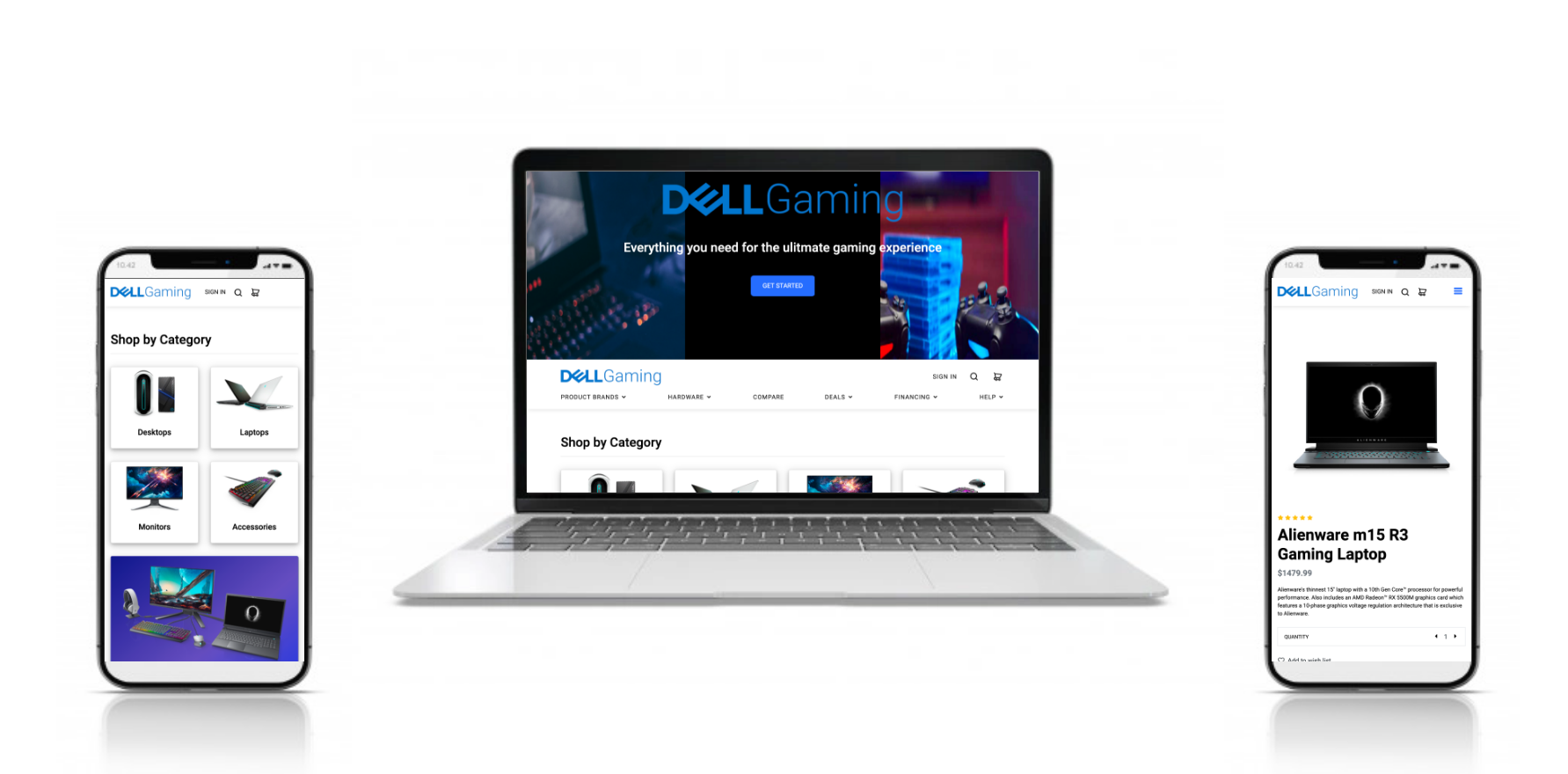
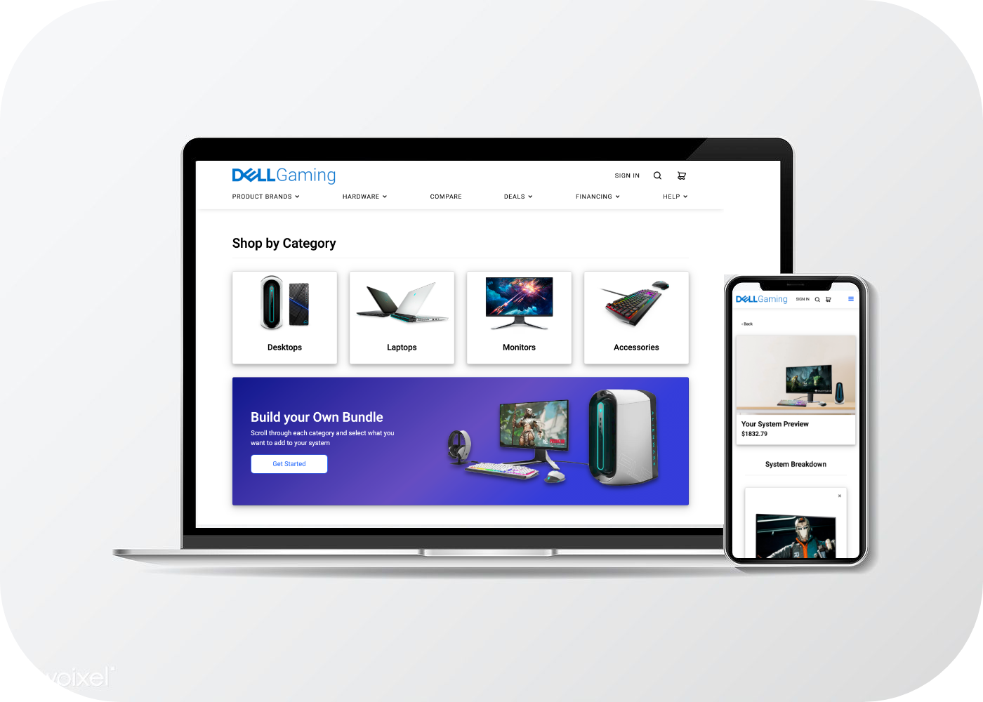
Dell Gaming, a subsite that immerses users into the world of gaming while showcasing the product in an approachable way. Additionally, this will allow users who have an interest in gaming a space to compare gaming products, prices, and specs to help them efficiently navigate through their options.
Defining the Problem
Dell's website does not optimize the shopping experience for gamers. Users struggle to find gaming products and are often overwhelmed and frustrated with the current website user path to completing a purchase.
How might we help users efficiently select, customize a product with a quick checkout process?
Challenge
Did you know that the video game industry brings in more revenue than the global movie and North American Sports industries combined? And once lockdown meaures were put in place Global Gaming sales spiked up about 20% reaching at $175 billion in 2020.
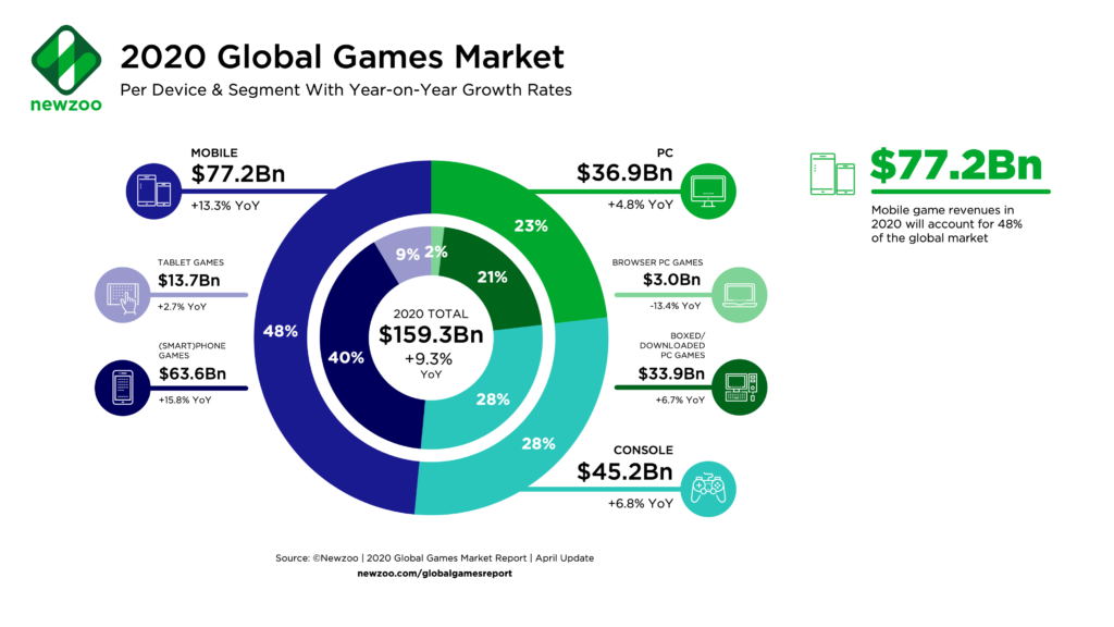
Our team came to a conclusion that a subsite focusing on Dell's gaming products would not only benefit their company but also a more all-inclusive e-commerce shopping experience for their gaming audience.

Research
In order to gain more knowledge behind a gamers shopping experience we interviewed subject matter experts, deployed surveys, and conducted a competitive analysis on a few competitors.
Our research objectives were pretty straight forward we wanted to understand how users search and choose their gaming products and accessories. And, also understand needs and their pain points during their shopping process.
- Task success rate (select product and checkout).
- Search vs. Navigation
- Time-on-Task
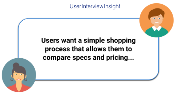
We interviewed 3 users who were all heavily involved in gaming and we determined that our users care most about having a simple shopping and checkout process that also allows them to compare specs and pricing.
The Discovery
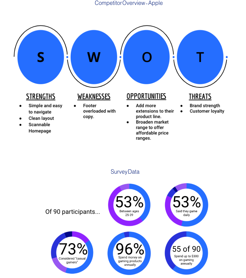
To start with the research, we analyzed few competitors such as IBM, Sony, Amazon. Apple's page had much to learn from, as the overall design layout was minimalistic and symmetrical to the eye which made it easy to navigate.

User Persona
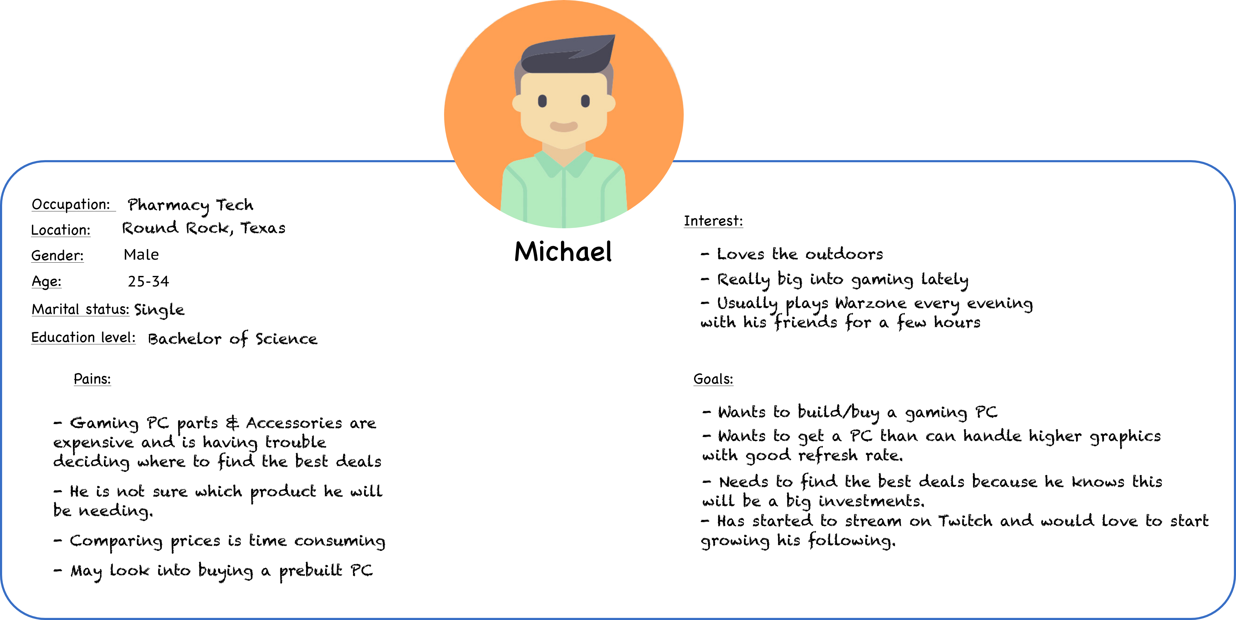
So after testing, interviewing, and surveying, we used our findings to create an affinity diagram and an empathy map in order to define who our users is.

Information Architecture
As expressed by users, the current dell website is confusing to navigate. We began the process of card sorting to better understand how to structure the website in a user friendly way. We used a card sorting technique where we reorganized the information and original navigation on the main Dell site into categories that made the most sense for the gaming microsite.
.jpg)
Based on the card sorting insights, we created a new site map that is simpler, focused more on gaming, and included added feature prioritization matrix like the "compare" and "build your own gaming system" options. WE wanted the microsite to feel cost efficent with easy maintenance.
Site map
Wireframes
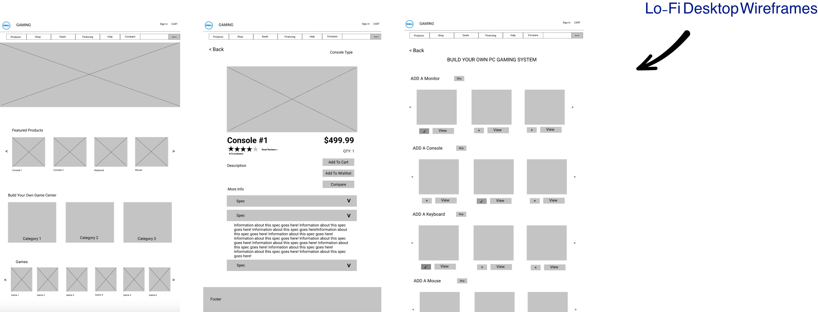
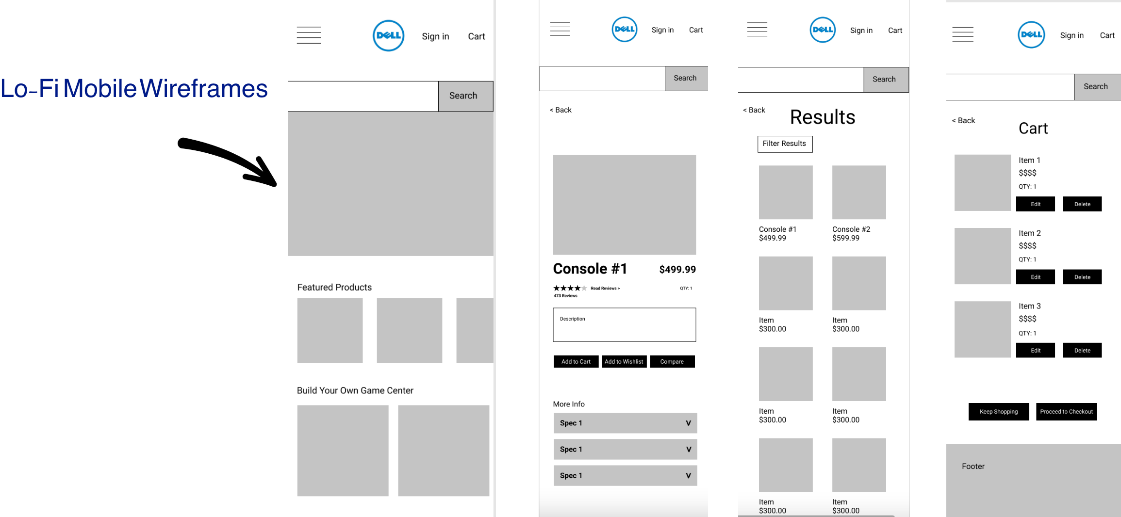
My next step involved looking through our site map, user flow, feature prioritization matrix to create sketches. Since I was working with many creative designers, it was relatively easy to move straight into digitial lo-fi prototypes.
Based on our features and information architecture, we came up with a simple layout with the goal of easy navigation, highlighting gaming products, not over-crowding the product page with specs, and including a quick checkout process. We worked toward these goals by adding multiple tabs in the navbar, buttons to reduce the amount of text and better visuals.

Detailed Specs
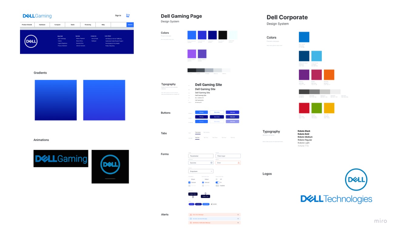
Before making those iterations and creating a hi-fi prototype, we created a UI style guide. Our goal was to stay aligned with Dell's branding to ensure brand recognition within the microsite. This inolved researching the main style guide for Dell as a company as a launching point for microsite styling.
Our goal was to make the gaming microsite feel like other gaming-specific product websites so we researched competitors like EA, Playstation, Xbox, and Aleinware. We found out that their color palettes included bright colors and contrasted with black and grey.
Taking what we learned from Dell's competitors, plus Dell's branding, we decided to make a color palette that included bright shades of blue, purple, and black. Lastly, we created new versions of the Dell logo, specifically for the gaming microsite.
The Execution
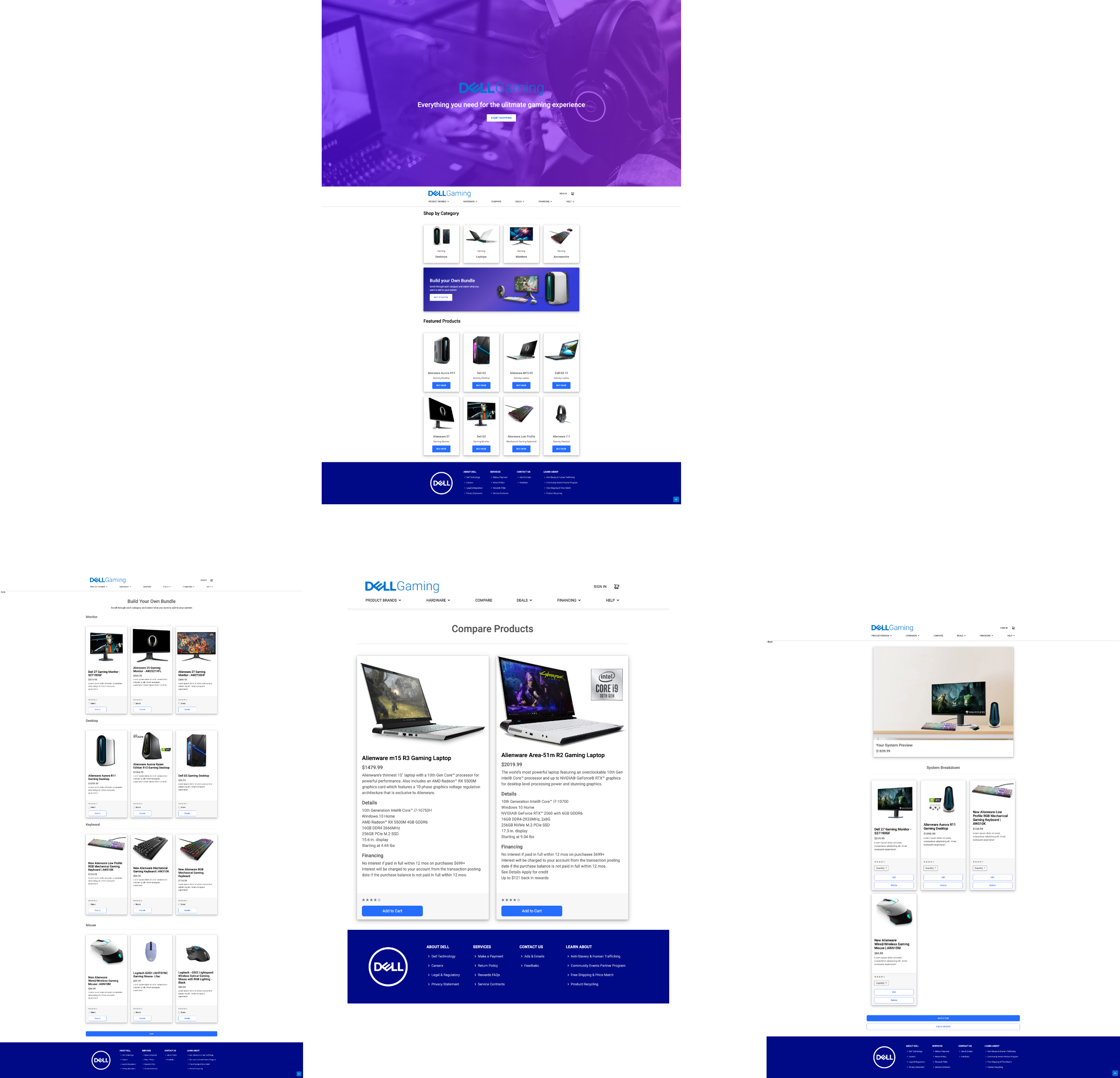
The gallery belows shows our high-fidelity desktop and mobile prototype. In our high-fidelity prototype, we resolved the user's pain points from the low-fidelity testing, aiming to make experience more intuitive.
- We added recommended items in the "view product" pages.
- We added multiple paths back to the Home Page.
- We differentiated "products" and "shop" tabs by renaming them to "product brands" and "hardware".

Validation
Testing Our AssumptionsOnce the team had a hi-fidelity prototype ready for use, we knew we needed to put it in the hands of our users. In this iteration, we tested the same 4 flows as the previous one and found out that the only task with 100% success rate was creating an account.
Interestingly, the themes we discovered during this phase were the same issues we discovered after launch:
- They had a hard time finding the "build your own pc system" tab and also found the naming of that feature confusing- they weren't sure if they were customizing a laptop or assembling a group of items.
- They found the design "boring and unoriginal".
- None of the images were clickable therefore the user was not able to 'add' anything to cart.
Unfortunately, there were some glitches with Figma that interfered with this testing round, like interactions not working even through they were prototyped correctly. We took that into consideration and had users tell us what they would do and how they would choose to navigate if the prototype was fully functioning.

Final Thoughts
We created this subsite to be more streamlined version of the gaming products section of the original Dell website.
Our site is Dell's version of a gaming product site - keeping their branding and functionality but adding those gaming site components. We drew inspirations from sites like Sony Playstation & EA Sports. Although limited by our coding knowledge at the time of the sites creation, we were able to build something that is easy for users to navigate and gave the site more gaming character than the original Dell gaming section.
What's Next...
- Continue to test and iterate the current design to improve interactions and experience for the users.
- Add more complex animations & Implement back-end coding - primarily focusing on
- Use a database to display all Dell gaming products.
- Keep track of the items added to cart and display the number of item in cart.
- Sign-in Authentication.
- Saving contact, shipping, and billing information for future purchases.


Latest Iteration
